SSRS: Display Series on SSRS Chart Based on Parameter Value
Monday, August 5, 2013
by jsalvo
I recently modified an SSRS report to display average run times for various SQL Agent jobs over the past 30, 14 and 7 days. Displaying all the averages simultaneously would make the chart cluttered and confusing; instead, I opted to control the displayed average via a parameter that the user can adjust if desired. I also wanted to shade the area of the chart beneath the series to make it easy to identify the job executions over the average run time. The result looks like this:
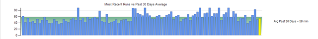
The vertical axis displays the job execution time in minutes, while the horizontal axis represents each job execution. The user has the ability to click on any job execution to view the details.
Before reading further, you may want to review this blog post that discusses shading an area of an SSRS chart if you are unfamiliar with the implementation.
The steps to control the displayed average in an SSRS chart are listed below :
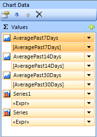
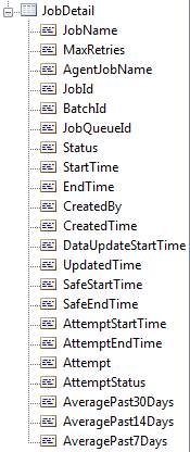
First, you must add the averages you are interested in calculating as columns in the output of your dataset. I have three columns in my dataset that represent the 30-day, 14-day and 7-day averages for a particular job execution. The columns are called AveragePast30Days, AveragePast14Days and AveragePast7Days.
Next, add a parameter to the report called ‘Displayed Average’. Select the ‘Available Values’ tab and enter the options the user can select from. In my example, I have three available values labeled ‘Past 7 Days’, ‘Past 14 Days’ and ‘Past 30 Days’.
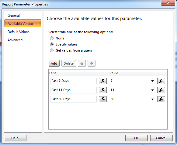
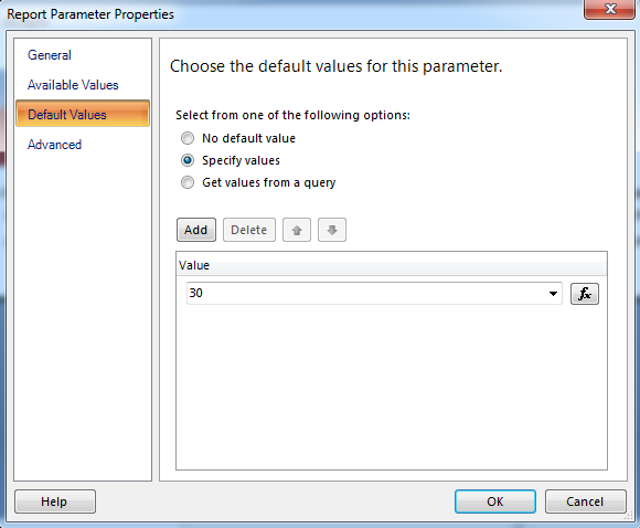
If you want the parameter to default to a specific value, click the ‘Default Values’ tab and enter the appropriate value. In this example, the default value is 30.
Once you’ve created the parameter, the next step is to add a series to the chart for each ‘Displayed Average’ option. In this example, I added three series to the chart called ‘AveragePast7Days’, ‘AveragePast14Days’, and ‘AveragePast30Days’.
The following outlines the configuration for the chart series ‘AveragePast7Days’, you will need to repeat these steps for any additional averages.
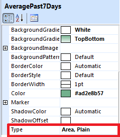
First, add a new series to the chart and set the series type in the ‘Series Properties’ to Type = ‘Area, Plain’.
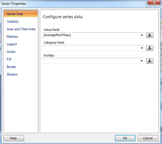
Series Data Tab
Set the value field to the appropriate column in your dataset.
Visibility Tab
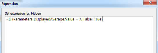
Update the field labeled ‘Show or hide based on an expression’. In this example the series should be displayed if the ‘Displayed Average’ parameter value is 7. The hidden expression is defined as follows:
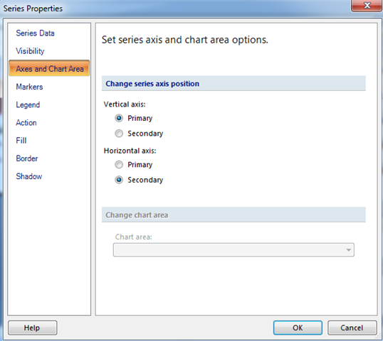
Axes and Chart Area
In this example, the Vertical axis is set as the Primary axis and the Horizontal axis is set as the Secondary axis. Setting the horizontal axis as the secondary axis allows the shaded area of the series to span the entire chart. Note: the secondary axis is hidden on the chart shown in the screen shot at the top of this post.
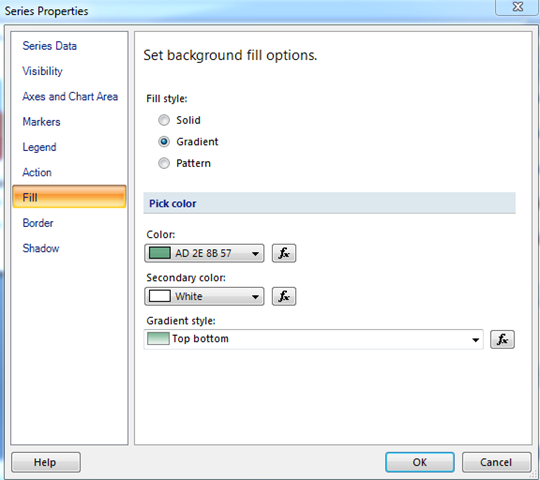
Fill
Set the color options to achieve the desired shading and gradient pattern.
The series also needs to be at the top of the list so it displays behind any other series on the chart. You can move the series in the list using the Up and Down arrows.