SSRS: Shading part of a chart area using Report Builder 3.0
Saturday, June 4, 2011
by jsalvo
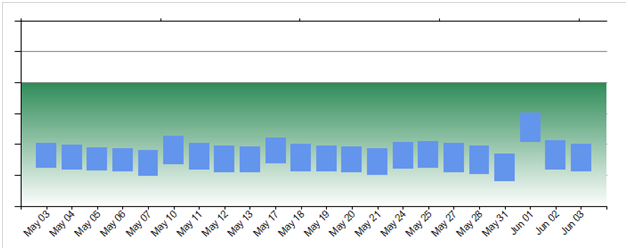
If you need to fill part of a chart area with a specified color (e.g. to highlight an acceptable range of values) one way to accomplish this task is to add an additional series. In this example, all values less than 480 are considered ‘acceptable’ and are therefore shaded green.
1. The first step is to add an additional series by clicking the green ‘+’ icon in the ‘Chart Data’ window. You may then either select a field or ‘Expression’. In this example I selected ‘Expression’ since I want to set my upper tolerance to 480 and shade the area beneath this value.
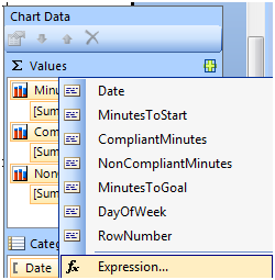
2. In the ‘Expression’ field, I entered ‘480’

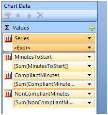
3. It is necessary to have the new series (labeled ‘Series’ in my screenshot) at the top of the list so it is displayed behind the other series. The series can be moved to the top of the list by clicking the up arrow.
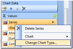
4. Click the drop-down next to ‘Series’ and select ‘Change Chart Type’.
[ ](
](
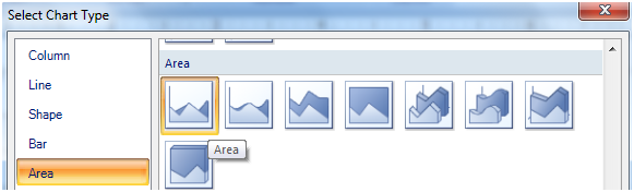
5. In the ‘Select Chart Type’ window, select the first option under ‘Area’.
6. Return to the ‘Chart Data’ window and again click the drop-down next to series. Now select ‘Series Properties’

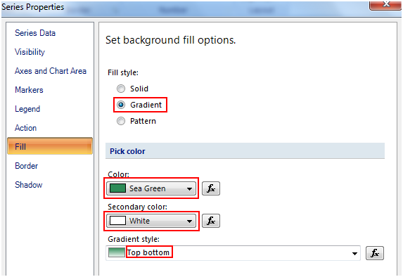
7. Click the option ‘Fill’ along the left hand side. In this example, I selected a top to bottom gradient that transitions from green to white.
8. If needed, associate the series with a secondary axis so the color extends across the entire length of the chart. Right click on the series and select properties. In the ‘Axes’ section, set ‘CategoryAxisName’ to ‘Secondary’.
Here’s an example of the chart with the desired area shaded green.